- Home
- Hockey News
- The Best NHL Jerseys
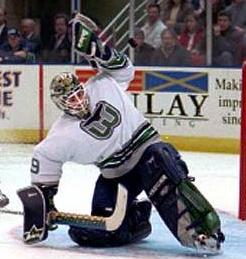
- The Hartford Whalers Jersey
The Hartford Whalers Jersey
Previously known as the New England Whalers in the WHA, the Hartford Whalers entered the NHL in 1979. In 1997, they moved and became the Carolina Hurricanes. A successful franchise in the WHA, the NHL Whalers enjoyed limited success. They had only three winning seasons out of 18, won only one playoff series and finished the regular season under .500 in each of their final seven seasons in Hartford.
While the team fared poorly on the ice, it excelled in at least one other area: by a broad consensus, the Hartford Whalers jersey was one of the best the NHL ever saw, and it has earned a spot as one of our Top 8 uniform picks at Pro Stock Hockey.
While the team fared poorly on the ice, it excelled in at least one other area: by a broad consensus, the Hartford Whalers jersey was one of the best the NHL ever saw, and it has earned a spot as one of our Top 8 uniform picks at Pro Stock Hockey.
The Classic, Creative Look of the Hartford Whalers Uniform

The primary logo of the Whalers jersey is simple at first glance, but there’s actually a lot going on in the design. The famous “W” is in the shape of a trident, with a blue whale fin diving toward it. The space between these two design elements forms a perfect “H.” We give this logo, created by graphic designer Peter Good, an A+.
In a 2014 interview, Good talked about the logo, noting that it is a rare exception of a logo that outlived its team in popularity (a testament not only to Good’s design talent, but also the loyalty and pride of Hartford’s hockey fans). Part of Good’s thinking in creating the logo was to move away from the harpoon image used in the old WHA logo — he didn’t think it made sense to suggest your mascot is being harpooned.
Good’s original logo design featured a white background, a green “W” and a blue whale fin. In 1992-93, the color scheme and design were tweaked to include a gray background, white outlines around the “W” and whale fin, and also to move to darker shades of green and blue. Overall, the power and elegance of the logo remained intact. The Whalers jerseys were simple, originally green or white with a modest amount of striping. In the 1992-93 season, to go along with the updated logo, the Hartford Whalers uniforms changed to dark blue and white, and gray was added as a secondary color. These 1992-97 Whalers jerseys rank 16th on the Bleacher Report’s list of the 50 best uniforms in NHL history. But wait, there’s more. Sports Illustrated ranks the Whalers jersey third in its list of the 10 greatest NHL logos of all time, and the NHL also named the iconic logo as one of the greatest NHL logos of all time.
Return of the Whaler Logo
It’s not just judging committees and design connoisseurs who love the Whalers logo and uni. When the Carolina Hurricanes announced they would be wearing Whalers jerseys in (at least) two 2018-19 regular-season games, fans went wild. The Hurricanes take pride in their history, and fans appreciate this trip down memory lane. In addition to the new throwback uniforms, the Hurricanes have been selling Whalers merchandise in high volume. As a matter of fact, Reebok states that Whalers-branded merchandise is the best-selling of all non-current NHL teams. The fans have spoken, and they are saying, “We are still excited about the Whalers."
Will the fans of Hartford ever get another NHL team? Admittedly, it’s a small market, but as we’ve pointed out in other articles, if the Green Bay Packers can do it in football, why can’t a hockey team do it in the NHL? When a team continues to enjoy support in two markets — if not throughout all of hockeydom — for almost 20 years, that would be one heck of a foundation on which to build a new Whalers tradition.
(Image Credit — Wikimedia Commons)
 Loading... Please wait...


